Custom Widget
Requirements:
- Have a project already set up with Beagle.
Introduction
Beagle already has some basic widgets that can be used to change your application UI through the backend. However, you can add new components to make your application’s views “visible” to Beagle and can also be used in the backend.
Step 1: Create custom component.
Below we have the definition of the Box component class. Created with view code in swift and has a title parameter.
import Foundation
import UIKit

class Box: UIView {

    // Class parameter.
    private var title: String

    // Initialization part of the class.
    public init(title: String) {
        self.title = title
        super.init(frame: .zero)
        setupView()
    }

    required init?(coder: NSCoder) {
        fatalError("init(coder:) has not been implemented")
    }

    // Method to add component to hierarchy and pass position.
    private func setupView() {
        addSubview(label)

        label.text = title
        label.topAnchor.constraint(equalTo: topAnchor).isActive = true
        label.leadingAnchor.constraint(equalTo: leadingAnchor).isActive = true
        label.trailingAnchor.constraint(equalTo: trailingAnchor).isActive = true
        label.bottomAnchor.constraint(equalTo: bottomAnchor).isActive = true
    }

    // Component `UILabel` created.
    private lazy var label: UILabel = {
        let label = UILabel()
        label.font = .systemFont(ofSize: 20, weight: .bold)
        label.backgroundColor = .red
        label.textAlignment = .center
        label.textColor = .white
        label.translatesAutoresizingMaskIntoConstraints = false
        return label
    }()
}
Step 2: Create Widget.
To make your component visible to the beagle just create a struct and extend the Widget interface which is a protocol that conforms to Decodable and is responsible for decoding the properties that your widget exposes to the backend, the interface will add the property of widgetProperties and the toView method.
Now with the Box component create a struct BoxWidget adopting the Widget protocol, the widget interface will add the widgetProperties property and the toView method.
widgetProperties: The property of applying style, id and accessibility.
toView: Method to return the view of the created component.
We have the structure of the struct BoxWidget with the parameters title and widgetProperties, in the method toView the component Box is instantiated passing the parameters title.
import Foundation
import UIKit
import Beagle

struct BoxWidget: Widget {

    // Class parameter.
    let title: String
    var widgetProperties: WidgetProperties

    // toView method of interface the  widget.
    func toView(renderer: BeagleRenderer) -> UIView {
        let boxComponent = Box(title: title)

        return boxComponent
    }
}
We have to create the initialization and decoding part of the component, there are two possible ways using the sourcery code generator for the Swift language, or doing it manually.
To make the manual you have to create the init and decode the title and widgetProperties parameters of the BoxWidget struct.
The widgetProperties has its property part decoding, so you just need to pass the decoder to the WidgetProperties object.
// Initialization part of the class.
public init(
    title: String,
    widgetProperties: WidgetProperties = WidgetProperties()
) {
    self.title = title
    self.widgetProperties = widgetProperties
}

// Enum with parameters for decoding.
enum CodingKeys: String, CodingKey {
    case title
}

// Initialization for decoding
public init(from decoder: Decoder) throws {
    let container = try decoder.container(keyedBy: CodingKeys.self)

    title = try container.decode(String.self, forKey: .title)
    widgetProperties = try WidgetProperties(from: decoder)
}
To embed the component with the beagle you need to use sizeThatFits or AutoLayoutWrapper.
AutoLayoutWrapper
AutoLayoutWrapper: The object calculates the size taking into account the component’s contraints.
To do this, just add the component’s view inside the AutoLayoutWrapper.
Making the settings with the AutoLayoutWrapper.
let beagleWrapper = AutoLayoutWrapper(view: boxComponent)
Below is the complete struct of the Widget with the steps:
- Adopt the
Widgetinterface. - Instantiate the Box component.
- Do the initialization and decoding part of the component.
- Use the
AutoLayoutWrapperin the BoxWidget struct.
import Foundation
import UIKit
import Beagle

struct BoxWidget: Widget {

    // Class parameter.
    let title: String
    var widgetProperties: WidgetProperties

    // Initialization part of the class.
    public init(
        title: String,
        widgetProperties: WidgetProperties = WidgetProperties()
    ) {
        self.title = title
        self.widgetProperties = widgetProperties
    }

    // Enum with parameters for decoding.
    enum CodingKeys: String, CodingKey {
        case title
    }

    // Initialization for decoding
    public init(from decoder: Decoder) throws {
        let container = try decoder.container(keyedBy: CodingKeys.self)

        title = try container.decode(String.self, forKey: .title)
        widgetProperties = try WidgetProperties(from: decoder)
    }

    // toView method of interface the  widget.
    func toView(renderer: BeagleRenderer) -> UIView {

        // Native component declaration.
        let boxComponent = Box(title: title)

        // Setting the beagle wrapper.
        boxComponent.translatesAutoresizingMaskIntoConstraints = false
        let beagleWrapper = AutoLayoutWrapper(view: boxComponent)

        // Returning BeagleWrapper and component.
        return beagleWrapper
    }
}
SizeThatFits
sizeThatFits: Method to implement your size logic, used in custom component class.
override func sizeThatFits(_ size: CGSize) -> CGSize {
    systemLayoutSizeFitting(size)
}
The custom component class with the step:
- Use sizeThatFits.
import Foundation
import UIKit

class Box: UIView {

    // Class parameter.
    private var title: String

    // Initialization part of the class.
    public init(title: String) {
        self.title = title
        super.init(frame: .zero)
        setupView()
    }

    required init?(coder: NSCoder) {
        fatalError("init(coder:) has not been implemented")
    }

    // Implementation sizeThatFits
    override func sizeThatFits(_ size: CGSize) -> CGSize {
        systemLayoutSizeFitting(size)
    }

    // Method to add component to hierarchy and pass position.
    private func setupView() {
        addSubview(label)

        label.text = title
        label.topAnchor.constraint(equalTo: topAnchor).isActive = true
        label.leadingAnchor.constraint(equalTo: leadingAnchor).isActive = true
        label.trailingAnchor.constraint(equalTo: trailingAnchor).isActive = true
        label.bottomAnchor.constraint(equalTo: bottomAnchor).isActive = true
    }

    // Component `UILabel` created.
    private lazy var label: UILabel = {
        let label = UILabel()
        label.font = .systemFont(ofSize: 20, weight: .bold)
        label.backgroundColor = .red
        label.textAlignment = .center
        label.textColor = .white
        label.translatesAutoresizingMaskIntoConstraints = false
        return label
    }()
}
Widget complete class with steps.
- Adopt
Widgetinterface. - Instantiate the Box component.
- Do the initialization and decoding part of the component.
import Foundation
import UIKit
import Beagle

struct BoxWidget: Widget {

    // Class parameter.
    let title: String
    var widgetProperties: WidgetProperties

    // Initialization part of the class.
    public init(
        title: String,
        widgetProperties: WidgetProperties = WidgetProperties()
    ) {
        self.title = title
        self.widgetProperties = widgetProperties
    }

    // Enum with parameters for decoding.
    enum CodingKeys: String, CodingKey {
        case title
    }

    // Initialization for decoding
    public init(from decoder: Decoder) throws {
        let container = try decoder.container(keyedBy: CodingKeys.self)

        title = try container.decode(String.self, forKey: .title)
        widgetProperties = try WidgetProperties(from: decoder)
    }

    // toView method of interface the  widget.
    func toView(renderer: BeagleRenderer) -> UIView {

        // Native component declaration.
        let boxComponent = Box(title: title)

        // Returning BeagleWrapper and component.
        return boxComponent
    }
}
Step 3: Register Widget.
It is mandatory to register it with Beagle. Within the beagle configuration file use dependencies to register.
The register method has two constructors, the first passing just the component and the second receiving the component and named.
component: Pass component’s class.
named: Parameter to set the component name. It is not mandatory to pass. One case is when the component name is registered differently than what you created in the backend. It will be used in deserializations to find your component.
Ways Register
// 1º manner
dependencies.decoder.register(component: BoxWidget.self)
// 2º manner
dependencies.decoder.register(component: BoxWidget.self, named: "BoxWidgetComponent")
After registering, don’t forget that to use your component in the backend it also has to be registered in your BFF (Backend to Frontend).
If you want to understand about BFF click here
Step 4: Component Declaration.
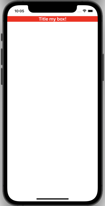
Below we have the definition of the component inside a Container, where the component BoxWidget has the parameter title that receives the value Title my box!.
 Container {
    BoxWidget(title: "Title my box!")
}
Rendered example:
If you use more complex components that are in UIViews or other components not mentioned, the process would be similar.
Feedback
Was this page helpful?
Glad to hear it! Please tell us how we can improve.
Sorry to hear that. Please tell us how we can improve.