⚠️ You are viewing documentation for version: v1.7
Beagle v1.7 is no longer actively maintained. The documented version you are viewing may contain deprecated functionality. For up-to-date documentation, see the latest version .
Tabview
You will find here a description of the component TabView and its attributes.
This component was deprecated in Beagle version 1.1.0 and will be removed in a future version. Use
TabBar instead.What is TabView?
A TabView is a component used to navigate between views that are listed in a tab. It displays all tabs that correspond to different previews that can be accessed through it.
The structure is represented by the attributes below:
| Attribute | Type | Required | Definition |
|---|---|---|---|
| children | List<TabItem> | ✓ | List of tab items available in the TabView component. The TabItem itself is not a widget, but its content is a server driven component received through Beagle. |
| styleId | String | It uses a key that is registered in the Design System of evert platform to customize your component. | |
| context | ContextData | Add a context to your TabView component. |
What is TabItem?
TabView is a component item that has this structure:
| Attribute | Type | Required | Definition |
|---|---|---|---|
| title | String | Displays the text in a TabView item. If it is not declared or if it is configured with the null value, it will not be shown on the screen. | |
| icon | Path | Displays a local image as an icon in the TabView item. If it is not declared or if it is configured with the null value, it will not be shown on the screen. | |
| child | Component | ✓ | Defines which view will be inflated in the TabItem, according to the tab clicked. Any server-driven component can be a Tab View item. |
If you don’t declare the title and the icon on the TabItem, the empty space will remain. If you need a navigation between viewers without Tab interface, it is recommended that you use the navigation component.
How to use it?
Screen(
  child = Container(
      children = listOf(
          TabView(children =
              listOf(
                  TabItem("Tab 1",
                      Text("First Tab Content").setFlex{ grow = 1.0 }
                  ),
                  TabItem("Tab 2",
                      Text("Second Tab Content").setFlex{ grow = 1.0 }
                  )
              )
              )
          )
      )
  )
| TabView full screen | TabView with dividing screen |
|---|---|
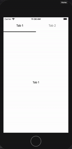 | 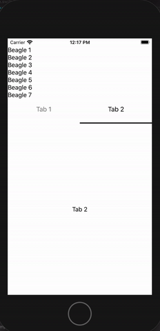 |
Feedback
Was this page helpful?
Glad to hear it! Please tell us how we can improve.
Sorry to hear that. Please tell us how we can improve.
Last modified June 1, 2021: update example of applyStyle and applyFlex on the api pages (#594) (bada7870)