OnChange Custom Widget
Currently in Beagle, the component TextInput has the behavior of executing an action list. To do this, it exposes the onChange property, which receives the list of actions that will be triggered.
In this tutorial we will see how to create a custom widget with the behavior of triggering a list of actions, we will create DatePicker a date selection component.
Step 1: Creating custom component on android
In your component’s class we will inherit from TextView and DatePickerDialog.OnDateSetListener.
class DatePickerComponent(
    context: Context
) : TextView(context), DatePickerDialog.OnDateSetListener {

    private val myCalendar: Calendar = Calendar.getInstance()
    var dateSetListener: DateSetListener? = null

    init {
        this.setOnClickListener {
            DatePickerDialog(context, this, myCalendar
                .get(Calendar.YEAR), myCalendar.get(Calendar.MONTH),
                myCalendar.get(Calendar.DAY_OF_MONTH)).show()
        }
    }

    fun setText(text: String) {
        this.text = text
    }

    private fun Date.formatDate(): String{
        val myFormat = "yyyy-MM-dd"
        val simpleDateFormat = SimpleDateFormat(myFormat, Locale.US)
        return simpleDateFormat.format(this).toString()
    }

    override fun onDateSet(view: DatePicker?, year: Int, month: Int, dayOfMonth: Int) {
        myCalendar[Calendar.YEAR] = year
        myCalendar[Calendar.MONTH] = month
        myCalendar[Calendar.DAY_OF_MONTH] = dayOfMonth
        dateSetListener?.onDateSet(myCalendar.time.formatDate())
    }

}

interface DateSetListener{
    fun onDateSet(value: String)
}
As we can see, we have some methods in class, below I will explain in detail.
In the init method is the click configuration, when the user clicks on the text he will display the calendar to select the date.
init {
        this.setOnClickListener {
            DatePickerDialog(context, this, myCalendar
                .get(Calendar.YEAR), myCalendar.get(Calendar.MONTH),
                myCalendar.get(Calendar.DAY_OF_MONTH)).show()
        }
    }
The setText method responsible for displaying the text for the user to click, example click here to select a date.
fun setText(text: String) {
        this.text = text
    }
The next method is an Extension function responsible for formatting the date.
private fun Date.formatDate(): String{
        val myFormat = "yyyy-MM-dd"
        val simpleDateFormat = SimpleDateFormat(myFormat, Locale.US)
        return simpleDateFormat.format(this).toString()
    }
This method came from the DatePickerDialog.OnDateSetListener interface and it is responsible for taking the date selected by the user.
- Through this method we will pass the value that the user selected to the method of the interface of our component
dateSetListener?.onDateSet(myCalendar.time.formatDate())
override fun onDateSet(view: DatePicker?, year: Int, month: Int, dayOfMonth: Int) {
        myCalendar[Calendar.YEAR] = year
        myCalendar[Calendar.MONTH] = month
        myCalendar[Calendar.DAY_OF_MONTH] = dayOfMonth
        dateSetListener?.onDateSet(myCalendar.time.formatDate())
    }
Step 2: Registering component in the beagle
Create a class and over the name put the annotation @RegisterWidget and inherit from the class WidgetView()
- Implement the
buildViewmethod that came from theWidgetView ()class - In this class we will add two attributes:
datethis attribute responsible for presenting the value of the selected date.onChangethis attribute responsible for taking the selected date value.
@RegisterWidget
class DatePicker(
    val date: Bind<String>,
    val onChange: List<Action>
) : WidgetView() {

    override fun buildView(rootView: RootView) = DatePickerComponent(rootView.getContext()).apply {

        observeBindChanges(rootView, this, date) { text ->
            text?.let { setText(it) }
        }

        dateSetListener = object : DateSetListener {
            override fun onDateSet(value: String) {
                this@DatePicker.handleEvent(
                    rootView,
                    this@apply,
                    onChange,
                    ContextData(
                        id = "onChange",
                        value = value
                    )
                )
            }
        }
    }
}
This block of code looks at the date attribute, when you change the value, it adds the new value.
observeBindChanges(rootView, this, date) { text ->
            text?.let { setText(it) }
        }
This code block has the interface of our component, where it overrides the onDateSet method that contains the value of the date selected by the user. Through this value we will create a ContextData with id onChange and the value will be the value returned by the interface method.
- And to get the updated value of the date, just use the expression
@{onChange}. In the Step below we will see how to get this value from onChange.
dateSetListener = object : DateSetListener {
            override fun onDateSet(value: String) {
                this@DatePicker.handleEvent(
                    rootView,
                    this@apply,
                    onChange,
                    ContextData(
                        id = "onChange",
                        value = value
                    )
                )
            }
        }
Step 3: Using component on a screen
Using the declarative kotlin of the beagle we create a screen, where we add the DatePicker component and below a text.
Below is an example using the component.
Container(
    context = ContextData(
        id = "ctx",
        value = "Escolha uma data"
    ),
    children = listOf(
            DatePicker(
                date = expressionOf("@{ctx}"),
                onChange = listOf(
                SetContext(
                    contextId = "ctx",
                    value = "@{onChange}"
                )
            )
        ),
            Text(text = expressionOf("@{ctx}"))
        )
    )
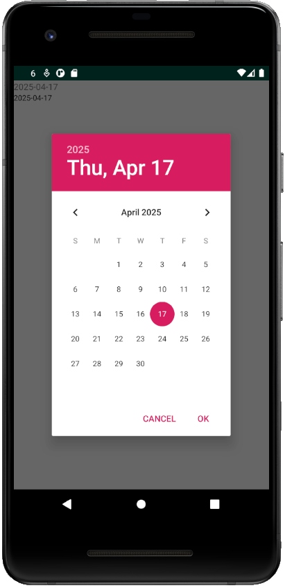
Below is an example on the emulator.
Feedback
Was this page helpful?
Glad to hear it! Please tell us how we can improve.
Sorry to hear that. Please tell us how we can improve.