Widget Customizado Simples
Como criar componentes (custom views) e widgets?
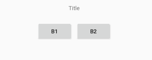
No exemplo abaixo, será implementado um custom widget e o componente que ele registrará. Esse componente será composto por um texto e dois botões dentro de um layout linear.
Os botões neste componente serão responsáveis por aumentar e diminuir o tamanho do texto do título e a tela será como a imagem a seguir:
@RegisterWidget e estendendo a classe WidgetView .Criando um componente e um widget
Siga os passos abaixo para criar e customizar um componente e um widget:
Passo 1: Criar o widget
Para criar um widget:
- Crie uma classe e a nomeie
"CustomWidgetTitleIncrease" - Aplique a anotação
@RegisterWidgeta esta classe; - Estenda essa classe utilizando a interface
WidgetView - A classe agora requisitará que você implemente o método
buildView. Nesse momento, deixe a classe como listada abaixo, pois a configuração desse método será finalizada depois.
CustomWidgetTitleIncrease.kt

@RegisterWidget
class CustomWidgetTitleIncrease: WidgetView() {
    override fun buildView(rootView: RootView): View {
        TODO("Not yet implemented")
    }
}
Passo 2: Criar e configurar o componente
Comece criando um arquivo de configuração.XMLe copie e cole o conteúdo abaixo, pois ela cria o layout que escolhemos para esse exemplo.
title_increase_component_layout.xml

<?xml version="1.0" encoding="utf-8"?>
<LinearLayout xmlns:android="http://schemas.android.com/apk/res/android"
    android:layout_width="match_parent"
    android:layout_height="wrap_content"
    android:gravity="center"
    android:orientation="vertical">

    <TextView
        android:id="@+id/tv_example_title"
        android:layout_width="match_parent"
        android:layout_height="wrap_content"
        android:gravity="center"
        android:padding="20dp"
        android:text="Example" />

    <LinearLayout
        android:layout_width="match_parent"
        android:layout_height="wrap_content"
        android:gravity="center">

        <Button
            android:id="@+id/bt_increase"
            android:layout_width="wrap_content"
            android:layout_height="wrap_content"
            android:layout_margin="5dp"
            android:text="B1" />

        <Button
            android:id="@+id/bt_decrease"
            android:layout_width="wrap_content"
            android:layout_height="wrap_content"
            android:layout_margin="5dp"
            android:text="B2" />
    </LinearLayout>
</LinearLayout>
Agora, é hora de criar o componente:
- Crie uma classe e a nomeie:
TitleIncreaseComponent. É nessa classe que ficará registrado como o componente funciona e a regra de negócio dele. Lembrando que a regra de negocio desse componente é unicamente aumentar e dimunir o tamanho do seu Título. - Copie e cole a classe abaixo:
class TitleIncreaseComponent(context: Context) : LinearLayout(context) {

    init {
        View.inflate(context, R.layout.title_increase_component_layout, this)
        changeTitleSize()
    }

    fun setTitleText(title: String) {
        tv_example_title.text = title
    }

    fun setTitleButton1(titleButton: String) {
        bt_increase.text = titleButton
    }

    fun setTitleButton2(titleButton: String) {
        bt_decrease.text = titleButton
    }

    private fun changeTitleSize() {

        var size = tv_example_title.textSize
        tv_example_title.textSize = size
        Toast.makeText(context, size.toString(), Toast.LENGTH_SHORT).show()

        bt_increase.setOnClickListener {
            if (size < 50) {
                size += 5f
                tv_example_title.textSize = size
            }
            Toast.makeText(context, size.toString(), Toast.LENGTH_SHORT).show()
        }

        bt_decrease.setOnClickListener {
            if (size > 5) {
                size -= 5f
                tv_example_title.textSize = size
            }
            Toast.makeText(context, size.toString(), Toast.LENGTH_SHORT).show()
        }
    }
}
Passo 3: Configurar o Widget
O layout e o componente estão definidos, é preciso terminar a configuração do Widget customizado:
Analise a função abaixo e observe que algumas variáveis de texto foram adicionadas. Essa prática foi escolhida para demonstrar que é possível definir o valor dessas variáveis pelo Widget, colocando o título e o nome dos botões.
CustomWidgetTitleIncrease.kt

@RegisterWidget
class CustomWidgetTitleIncrease(
    private val title: String,
    private val buttonTitle1: String,
    private val buttonTitle2: String
) : WidgetView() {

    override fun buildView(rootView: RootView) =
        TitleIncreaseComponent(rootView.getContext()).apply {
            setTitleText(title)
            setTitleButton1(buttonTitle1)
            setTitleButton2(buttonTitle2)
        }
}
Passo 4: Exibir o componente
Agora o Widget customizado está pronto, o componente pode ser exibido.
Para testar o componente, utilize o método abaixo:
- Perceba que o widget passa alguns parâmetros para o componente, como o “Título” do componente e o título dos botões.
- O método buildView foi implementado dentro do widget que customizamos
MainActivity.kt
import br.com.zup.beagle.android.utils.toView

class MainActivity : AppCompatActivity() {

    override fun onCreate(savedInstanceState: Bundle?) {
        super.onCreate(savedInstanceState)

        val customWidget = CustomWidgetTitleIncrease(
                "Example Title",
                "Increase",
                "Decrease"
            )

        setContentView(customWidget.toView(this))
    }
}
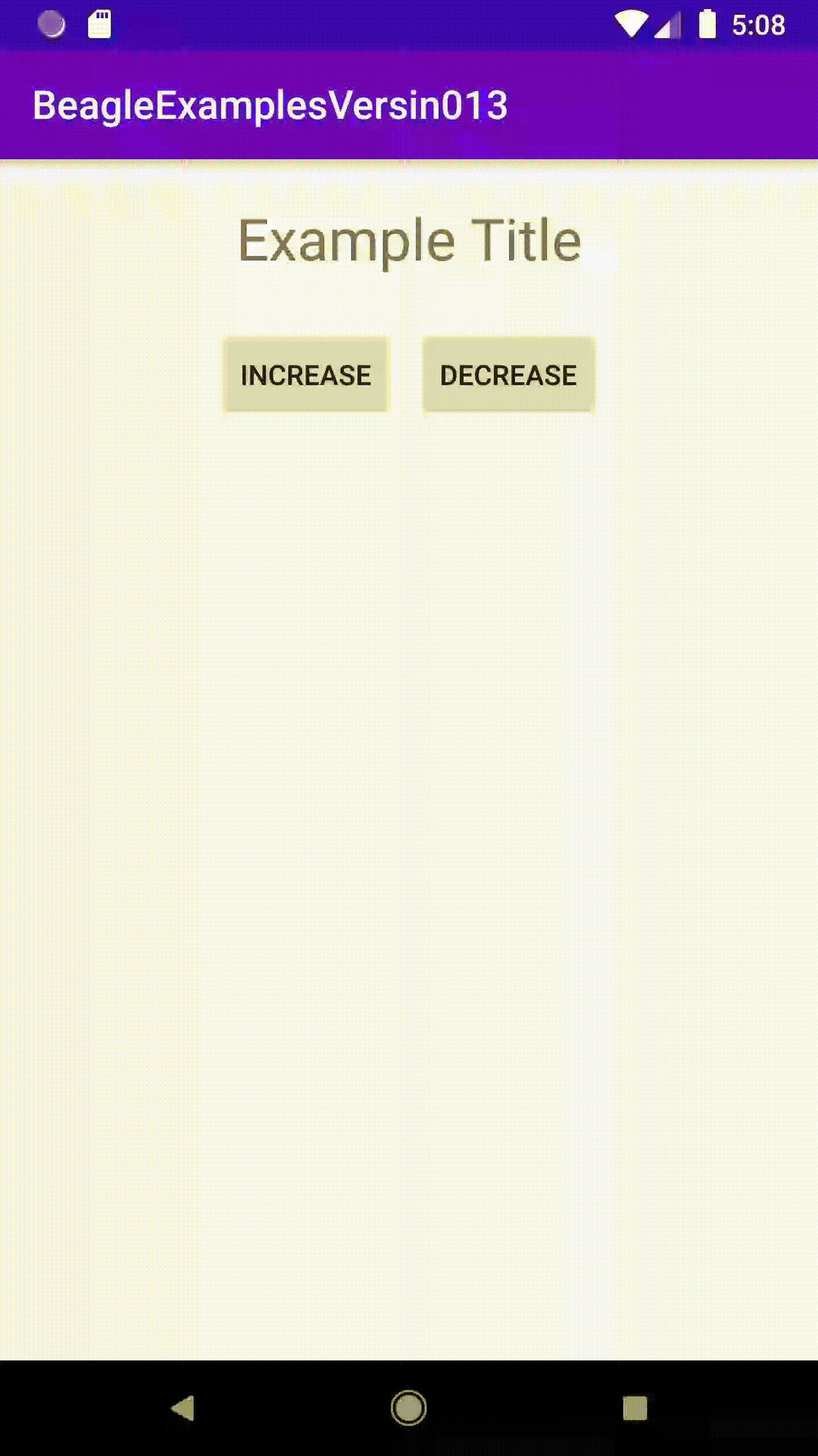
- Execute a aplicação e seu componente customizado (nesse caso uma tela) será exibido:
Feedback
Was this page helpful?
Glad to hear it! Please tell us how we can improve.
Sorry to hear that. Please tell us how we can improve.