Simple Custom Widget
Here you will learn how to create and use a widget in Beagle.
How to create components (custom views) and widgets?
The example below shows how a custom widget will be implemented and which component it will register. It will have:
- A text;
- Two buttons inside a linear layout.
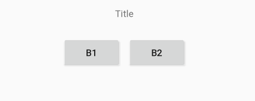
The buttons in this component will be responsible for increasing and decreasing the text’s size and the screen will be like the image below:
You can do this using
@RegisterWidget annotation and extending the WidgetView class.Follow the next steps to create and customize a component and a widget:
Step 1: Create widget
- Create a class and name it
"CustomWidgetTitleIncrease"; - Apply the annotation
@RegisterWidget; - Extend this class using WidgetView interface;
- This class now will request a toView method to be implemented. Change the class as listed below:
CustomWidgetTitleIncrease.kt

@RegisterWidget
class CustomWidgetTitleIncrease: WidgetView() {
    override fun buildView(rootView: RootView): View {
        TODO("not implemented")
}
Step 2: Create and configure the component
- Create a
.XMLconfiguration file and copy and paste the content below, it will create a layout:
title_increase_component_layout.xml

<?xml version="1.0" encoding="utf-8"?>
<LinearLayout xmlns:android="http://schemas.android.com/apk/res/android"
    android:layout_width="match_parent"
    android:layout_height="wrap_content"
    android:gravity="center"
    android:orientation="vertical">

    <TextView
        android:id="@+id/tv_example_title"
        android:layout_width="match_parent"
        android:layout_height="wrap_content"
        android:gravity="center"
        android:padding="20dp"
        android:text="Example" />

    <LinearLayout
        android:layout_width="match_parent"
        android:layout_height="wrap_content"
        android:gravity="center">

        <Button
            android:id="@+id/bt_increase"
            android:layout_width="wrap_content"
            android:layout_height="wrap_content"
            android:layout_margin="5dp"
            android:text="B1" />

        <Button
            android:id="@+id/bt_decrease"
            android:layout_width="wrap_content"
            android:layout_height="wrap_content"
            android:layout_margin="5dp"
            android:text="B2" />
    </LinearLayout>
</LinearLayout>
Now, you have to create the component:
- Create a class and name it:
TitleIncreaseComponent. This class will register how the component work and the business rule; - Copy and paste the class below:
class TitleIncreaseComponent(context: Context) : LinearLayout(context) {

    init {
        View.inflate(context, R.layout.title_increase_component_layout, this)
        changeTitleSize()
    }

    fun setTitleText(title: String) {
        tvExampleTitle.text = title
    }

    fun setTitleButton1(titleButton:String){
        btIncrease.text = titleButton
    }
    fun setTitleButton2(titleButton:String){
        btDecrease.text = titleButton
    }

    private fun changeTitleSize(){

        var size = tvExampleTitle.textSize
        tvExampleTitle.textSize = size
        Toast.makeText(context, size.toString(), Toast.LENGTH_SHORT).show()

        val textView = findViewById<TextView>(R.id.tvExampleTitle)
        val b1 = findViewById<Button>(R.id.btIncrease)
        val b2 = findViewById<Button>(R.id.btDecrease)

        b1.setOnClickListener {
            if(size < 50){
                size += 5f
                tvExampleTitle.textSize = size
            }
            Toast.makeText(context, size.toString(), Toast.LENGTH_SHORT).show()
        }

        b2.setOnClickListener {
            if(size > 5){
                size -= 5f
                tvExampleTitle.textSize = size
            }
            Toast.makeText(context, size.toString(), Toast.LENGTH_SHORT).show()
        }
    }
}
Step 3: Configure the widget
The layout and the component are defined, it is necessary to finish the configuration of the customized widget.
- Check the function below and see that some text variables were added. This was chosen to demonstrate that it is possible to define the value of this variables by the widget, adding title and button names:
CustomWidgetTitleIncrease.kt

@RegisterWidget
class CustomWidgetTitleIncrease(
    private val title: String,
    private val buttonTitle1: String,
    private val buttonTitle2: String
) : WidgetView() {

    override fun buildView(rootView: RootView) =
        TitleIncreaseComponent(rootView.getContext()).apply {
            setTitleText(title)
            setTitleButton1(buttonTitle1)
            setTitleButton2(buttonTitle2)
        }
}
Step 4: Display the component
The customized widget is now ready, the component can be displayed.
- To test the component, use the method below:
MainActivity.kt

class MainActivity : AppCompatActivity() {

    override fun onCreate(savedInstanceState: Bundle?) {
        super.onCreate(savedInstanceState)

        setContentView(
            CustomWidgetTitleIncrease(
                "Example Title",
                "Increase",
                "Decrease"
            ).buildView(rootView = object : RootView {
                override fun getContext() = this@MainActivity

                override fun getLifecycleOwner() = this@MainActivity
            })
        )
    }
}
- Run the aplication and your component will be displayed:

Feedback
Was this page helpful?
Glad to hear it! Please tell us how we can improve.
Sorry to hear that. Please tell us how we can improve.
Last modified September 17, 2021: Reviewed Android section (#773) (e4c75e98)