Overview
Here, you’ll find information about Beagle before getting deeper in the project.
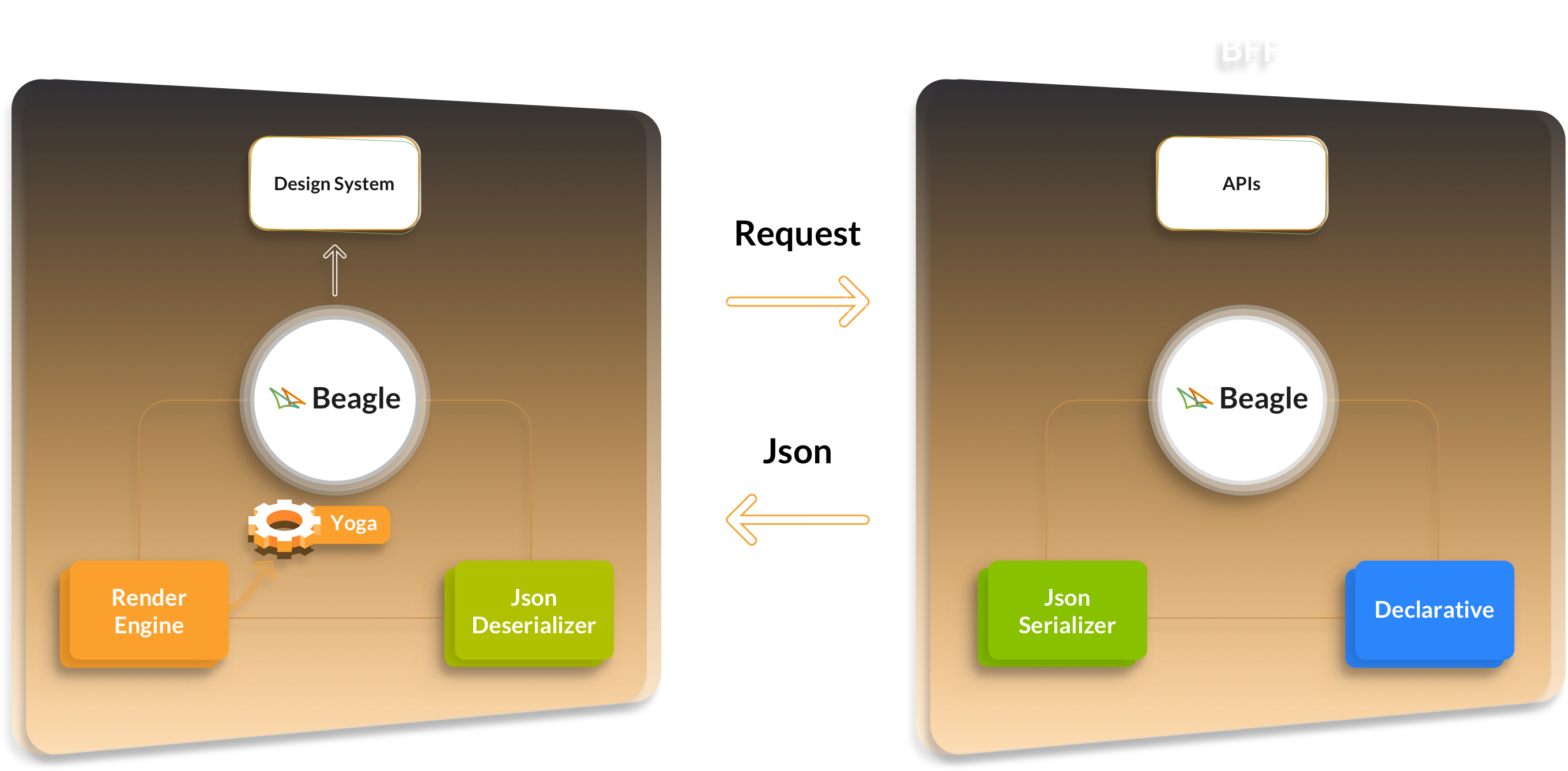
Beagle is an open source framework that helps developers implement Server-Driven UI in a cross-platform way.
By using Beagle, developers can:
The best way to understand Beagle is to see it in action. That’s why we’ll show you how to build a simple screen with Beagle.
We’ll comment on each piece of the screen (text, image, button, and style settings), and leave links to other parts of the documentation that go into more detail. By the end of this page, you’ll become familiar with the most common features of Beagle.
The links to other pages are only for further information, you don’t need to access them right away.
That said, here’s the screen we will discuss:
Throughout the documentation, you will see examples – like the one above – that use a tool we made named Playground. By using it, you can:
- Quickly see how Beagle works;
- Edit the code on the left, run it, and observe the result;
- Select different platforms to run your code on.
For more information about this tool, check out the Playground section.
As you can see on the left side, we are declaring our screen with JSON. This JSON is what the backend would provide to the frontend via an HTTP response. The frontend will then interpret it, and properly render it on the platform’s screen (as you can see on the right side). Beagle provides libraries on the backend and frontend to handle this workflow for you.
We use JSON in the examples because it is the most straightforward way to use Beagle. However, Beagle actually has a “language” (DSL in Kotlin) that you can use in your backend to produce this same JSON in a more productive way – with autocomplete and other benefits.
Check out which frontend platforms Beagle supports in the platforms and versions section. They all render components natively, that is, if you use Beagle in a native mobile application on Android or iOS, the libraries for these platforms will use native UIs (Android Views and UIKit, respectively), and you can even integrate your own native components to work with Beagle.
Now, let’s take a closer look inside that JSON, so you can better understand Beagle’s capabilities. The first thing to notice is its structure:
{
  "_beagleComponent_": "beagle:container",
  "style": {...},
  "children": [
    {
      "_beagleComponent_": "beagle:image",
      ...
    },
    {
      "_beagleComponent_": "beagle:text",
      ...
    },
    {
      "_beagleComponent_": "beagle:button",
      ...
    }
  ]
}
To Beagle, every structure that contains the _beagleComponent_ attribute will be interpreted as a Component. The first one is a simple and common component named Container, which allows you to group together children components. It has 3 children: Image, Text, and Button. Each one have different attributes to customize their rendering, and you can see all available attributes in each component’s API documentation.
The Image component, for example, has an attribute named path that especifies where to retrieve image data, it can be remote or local.
Check out below, we used a remote path by providing a url which Beagle will use to make a network request when the component gets rendered:
{
  "_beagleComponent_": "beagle:image",
  "path": {
    "_beagleImagePath_": "remote",
    "url": "https://i.ibb.co/rvRN9kv/logo.png"
  },
  "style": {...}
}
You can have full control of the network request triggered by this remote image. You just need to configure your own Network Layer as a Beagle Dependency. To better understand how to do that, or how to configure other Beagle Dependencies, you can check the Customization section of each platform (Android, iOS, Web.
Beagle already comes with a lot of useful components, you can browse them all in the components section. There are other components, for example, that have the children attribute (sometimes just child) like Screen and ListView, and they are used to compose view hierarchies like a Container. You can also define your own components, called Custom Components (Android, iOS, Web, and use them in a very similar way to a component that comes with Beagle.
Let’s take a closer look into the style attribute, which describes how to position and layout components and their children:
{
  "_beagleComponent_": "beagle:container",
  "style": {
    "flex": {
      "flexDirection": "COLUMN",
      "alignItems": "CENTER",
      "justifyContent": "CENTER"
    },
    "size": {
      "height": {
        "value": 100,
        "type": "PERCENT"
      }
    },
    "backgroundColor": "#FFF"
  },
  "children": [...]
}
Most components have this attribute, and it’s responsible for an important Beagle feature: developers have control through backend on UI positioning. You can experience that by changing the flexDirection attribute to ROW in the Playground, and you will see the same views positioned horizontally. In your real application, you can deploy this exact change in the backend, and it will be reflected immediately in the frontend – even on mobile platforms, you don’t need store updates.
Many tools built in-house for Server Driven UI don’t allow this kind of power over a UI positioning and this comes out of the box with Beagle.
In the example’s Container, we are using 3 styling attributes: flex, size, and backgroundColor. There are other options as well, you can see them in the Style section.
The flex attribute allows you to use the same Layout Engine on different platforms. This can be a huge win for your team because all platforms will position views according to the same rules, and you won’t need to “duplicate” layout logic for each platform.
If you have experience with web development, you probably already know how to use flex, since it is used as a cross-platform CSS Flexbox. To accomplish this, Beagle uses a library called Yoga, a cross-platform library developed in C++ by Facebook, and also used in other projects (e.g: React Native).
If you are not familiar with Flexbox, check out the positioning section, and the Yoga’s documentation for more details.
Finally, let’s talk about Actions, a way to add runtime dynamism to a Beagle component. In the example, there is an action inside a button:
{
  "_beagleComponent_": "beagle:button",
  "text": "Click here to show an Alert",
  "onPress": [
    {
      "_beagleAction_": "beagle:alert",
      "title": "My Title",
      "message": "Alert message"
    }
  ]
}
The Button component has an attribute named onPress that can receive a list of actions, which will only be executed when the button gets pressed. You can see all Beagle’s default actions in the Actions section. But it’s also possible to create your own actions (a proccess similar to Custom Components), which we call Custom Actions (Android, iOS, Web.
This example uses an Alert action, which results in showing an alert component when someone taps the button. You can do that in the Playground and see it yourself.
Besides showing an alert, you can use actions to:
Also, actions are one of the building blocks of making complex and dynamic screens. You can see more about this topic in the “How to make communication between components” section.
After seeing Beagle’s most essential parts, you are now ready to dive into more advanced topics:
If you want to see a more complex example of an application that completely leverages Beagle, you can check this repo. It has a backend in Kotlin, and native mobile frontends in Android and iOS.
If you want to start a new project with Beagle or integrate Beagle in your existing application, you can follow the installation guide of eache platform (Android, iOS, Web.
If you want to know more of a particular API, use the API section.
If you are not sure how to find information about a specific context, use the search bar on the top right corner of the screen to search for words throughout this documentation.
Beagle has different libraries/frameworks for each supported platform, in the following list you can see and access the most up to date versions:
Backend Kotlin:
Mobile:


Web:


Here, you’ll find information about Beagle before getting deeper in the project.
Here, you’ll find all the definitions for the main terms and expressions used on our documentation and on Beagle.
This section contains information on how to add Beagle into an Android project
Here you will find information about how to configure Beagle in a iOS application
In this section you will learn more about Beagle Web’s functionality and how to add it to your project depending on the framework being used
This section lists all the backend technologies Beagle currently supports
Here you will find the Beagle API and examples of use
Here, you’ll find the main features of beagle.
In this section, you will find a sandbox environment to test Beagle’s features
In this section you will find some plugins made to help creating Beagle components and pages
Follow the steps necessary for your contribution to be accepted by our team.
In this section we publish articles about the Beagle framework like features, migration guides for outdated functionalities and more.
Here, you’ll find answers to frequently asked questions about Beagle.
Was this page helpful?
Glad to hear it! Please tell us how we can improve.
Sorry to hear that. Please tell us how we can improve.