Simple Custom Widget
How to create components and widgets?
To create a component and register it on the Front end, it is necessary to create a Widget and a Component that will return a view.
What is the difference between a component and a widget?
- A component holds all the logic referring to the component’s functionality. In our example, this is where the logic for increasing the text size will be. This information is usually implemented on the front end.
- A widget is the structure through which we will pass information to our component, such as the text referring to the title and buttons. This is the one we declare in the hierarchy of a screen in the backend. It is also used to register the component and its signature on Beagle (its contract, properties, etc., both in the back and frontend).
We implement a custom component and a Widget that will register it on the example below. This component has:
- A text
- Two buttons within a linear layout.
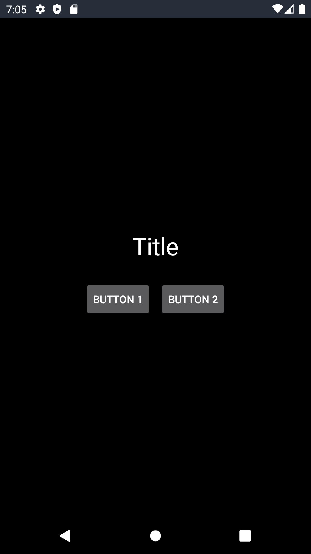
The buttons here are be responsible for increasing and decreasing the size of the title text. The screen will look like the following image:
@RegisterWidget and extensions, like WidgetView.Creating a widget
To create a widget:
- Create a class and name it
"CustomWidgetTitleIncrease" - Apply the
@RegisterWidgetannotation to this class; - Extend this class using the
WidgetViewinterface - The class will now ask you to implement the
buildViewmethod. At this point, leave the class as listed below, as the configuration of this method will be finished later:
CustomWidgetTitleIncrease.kt

@RegisterWidget
class CustomWidgetTitleIncrease: WidgetView() {
    override fun buildView(rootView: RootView): View {
        TODO("Not yet implemented")
    }
}
Step 2: Creating and configuring the component
Start by creating a .XML configuration file and copy and paste the content below, as it creates the layout chosen for this example:
title_increase_component_layout.xml

<?xml version="1.0" encoding="utf-8"?>
<LinearLayout xmlns:android="http://schemas.android.com/apk/res/android"
    android:layout_width="match_parent"
    android:layout_height="wrap_content"
    android:gravity="center"
    android:orientation="vertical">

    <TextView
        android:id="@+id/tv_example_title"
        android:layout_width="match_parent"
        android:layout_height="wrap_content"
        android:gravity="center"
        android:padding="20dp"
        android:text="Example" />

    <LinearLayout
        android:layout_width="match_parent"
        android:layout_height="wrap_content"
        android:gravity="center">

        <Button
            android:id="@+id/bt_increase"
            android:layout_width="wrap_content"
            android:layout_height="wrap_content"
            android:layout_margin="5dp"
            android:text="B1" />

        <Button
            android:id="@+id/bt_decrease"
            android:layout_width="wrap_content"
            android:layout_height="wrap_content"
            android:layout_margin="5dp"
            android:text="B2" />
    </LinearLayout>
</LinearLayout>
Now, it’s time to create the component:
- Create a class and name it:
TitleIncreaseComponent. It is in this class that sets how the component works and its business rule. Please keep in mind that the business rule of this component is only to increase and decrease the size of your Title. You can add any rule and configuration you wish. - Copy and paste the class below:
class TitleIncreaseComponent(context: Context) : LinearLayout(context) {

    init {
        View.inflate(context, R.layout.title_increase_component_layout, this)
        changeTitleSize()
    }

    fun setTitleText(title: String) {
        tv_example_title.text = title
    }

    fun setTitleButton1(titleButton: String) {
        bt_increase.text = titleButton
    }

    fun setTitleButton2(titleButton: String) {
        bt_decrease.text = titleButton
    }

    private fun changeTitleSize() {

        var size = tv_example_title.textSize
        tv_example_title.textSize = size
        Toast.makeText(context, size.toString(), Toast.LENGTH_SHORT).show()

        bt_increase.setOnClickListener {
            if (size < 50) {
                size += 5f
                tv_example_title.textSize = size
            }
            Toast.makeText(context, size.toString(), Toast.LENGTH_SHORT).show()
        }

        bt_decrease.setOnClickListener {
            if (size > 5) {
                size -= 5f
                tv_example_title.textSize = size
            }
            Toast.makeText(context, size.toString(), Toast.LENGTH_SHORT).show()
        }
    }
}
Step 3: Configuring the Widget
Now that the layout and component are defined, we need to finish configuring the custom widget
Review the function below and notice that some text variables have been added.
- These variables will receive values for texts that will define the componente title (that will change size) and the Buttons titles.
- The text values will be defined from a JSON that will represent a screen with the component created on this example (We will show you this JSON later).
CustomWidgetTitleIncrease.kt

@RegisterWidget
class CustomWidgetTitleIncrease(
    private val title: String,
    private val buttonTitle1: String,
    private val buttonTitle2: String
) : WidgetView() {

    override fun buildView(rootView: RootView) =
        TitleIncreaseComponent(rootView.getContext()).apply {
            setTitleText(title)
            setTitleButton1(buttonTitle1)
            setTitleButton2(buttonTitle2)
        }
}
Step 4: Displaying the component
Now that the custom widget is ready, the component can be displayed.
You don’t have to configure an entire backend just for testing, you can mock the JSON below, which will simulate an endpoint with a screen that contains the component you just created here on the frontend. (This JSON mocks a backend response. If you wish to check how to create this componente on a backend, please click here).
{
  "_beagleComponent_":"beagle:screenComponent",
  "child":{
    "_beagleComponent_":"beagle:container",
    "children":[
      {
        "_beagleComponent_":"custom:customWidgetTitleIncrease",
        "title":"Title",
        "buttonTitle1":"Button 1",
        "buttonTitle2":"Button 2"
      }
    ],
    "style":{
      "backgroundColor":"#000000",
      "cornerRadius":{

      },
      "size":{

      },
      "flex":{
        "justifyContent":"SPACE_AROUND",
        "alignItems":"CENTER",
        "grow":1
      }
    }
  }
}
Now just load it from an Activity on Android, as in the example below:
MainActivity.kt

class MainActivity : AppCompatActivity() {

    override fun onCreate(savedInstanceState: Bundle?) {
        super.onCreate(savedInstanceState)
        setContentView(R.layout.activity_main)

        val intent = this.newServerDrivenIntent<ServerDrivenActivity>(RequestData(url = "yourMockedJSONAddress"))
        startActivity(intent)
    }
}
- Run the application and your custom component (in this case a screen) will be displayed:
Feedback
Was this page helpful?
Glad to hear it! Please tell us how we can improve.
Sorry to hear that. Please tell us how we can improve.